 |||
|||
I covered some asteroid and NEA basics in my last post. In this post, we will examine some NEA/NEO data and try and understand some metrics related to potentially hazardous/dangerous NEO (Near Earth Objects). Let’s begin.
Our exploration starts with some publicly available data via the CNEOS API, specifically, I will be examining the following dataset.
Setting the following values “Observed anytime”, “Any impact probability”, “Any Palermo scale” and “Any H” returns a database query which at the time of this writing produces a dataset with 990 rows. I have converted the dataset to CSV and connected it to a Google Collab notebook making a runnable Python 3.7 notebook with minimal effort. I’ll put a link to the CSV file I used here. Feel free to use a Python 3.7 setup of your choice!
The dataset that has been converted to CSV is a specialised subset of NEO data that focuses on Impact Risk (the Sentry Dataset). Since I’m using Google Collab for this example, I had to use the IO file upload feature to upload the file from my PC to Collab prior to reading the file as a CSV, and storing it in a Pandas data frame.
import pandas as pd
import numpy as np
import matplotlib.pyplot as plt
from google.colab import files
uploaded = files.upload()
Once the upload tool has completed its task, it’s time to convert the CSV into a Pandas data frame. I like to keep the upload separate from the CSV reading in case I have to modify this approach later. On a new cell run,
sentry_data = pd.read_csv('cneos_sentry_summary_data.csv')
sentry_data.head()
Let’s look at the results
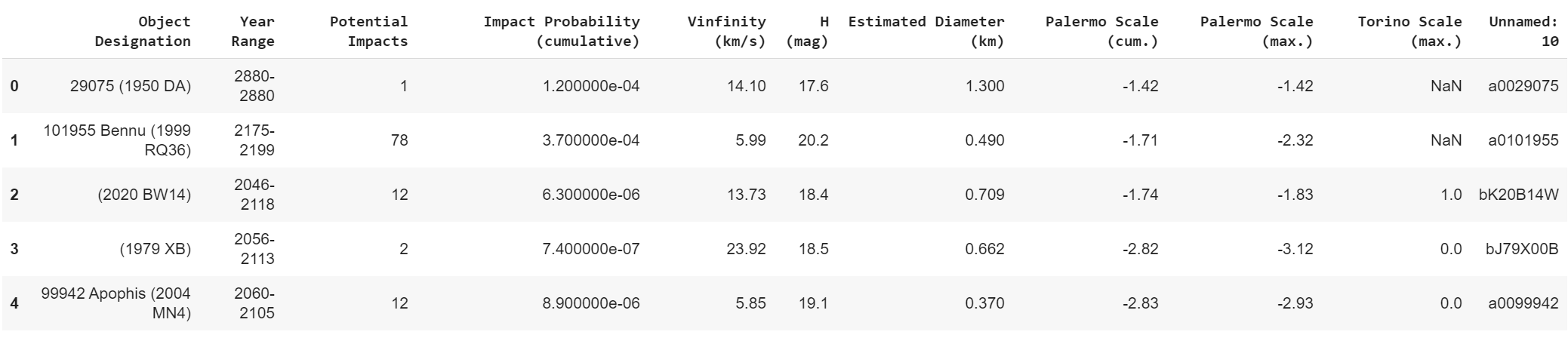 Fig 1 — First five rows of the Sentry Data
The “Object Designation” can be considered to be the unique identifier and it appears that the data is predictive in that if you examine the “Year Range” column it provides a forward-looking time frame.
Examining the next column it becomes clear that the data is providing predictive information regarding impacts that may occur during the specified time period. The next column is the Impact Probability. While this measure doesn’t singlehandedly inform us of the materiality of a potential impact, it does indicate the probability of potential impacts within the specified timeframe. It appears that the “Impact Probability” is a measure of cumulative probability. For example, it can be inferred that for the object with designation 101955 Bennu, 78 impacts may occur between the years 2175–2199 with an extremely low probability of 0.00037, cumulative.
The Impact Probabilities of the five objects considered seem to be fairly low so it would be interesting to order the data to determine which objects have relatively high probabilities of impact, particularly in year ranges much closer to 2020. The CNEOS website provides a neat legend for the columns under consideration.
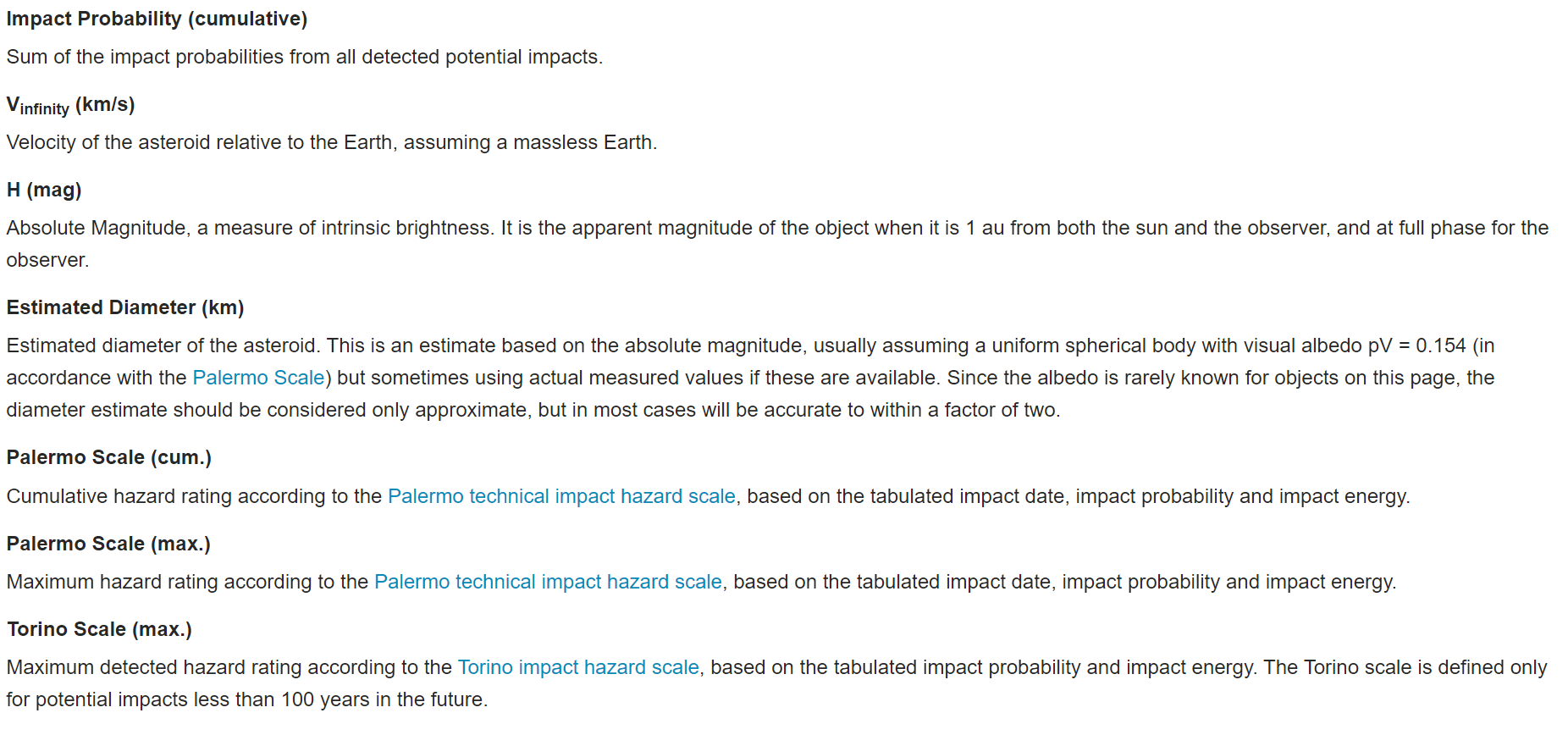 Fig 2 — CNEOS Sentry Data Legend
Continuing our exploration, we use,
sentry_data.info()It looks like there’s some missing data or NaNs in the Torino Scale column.
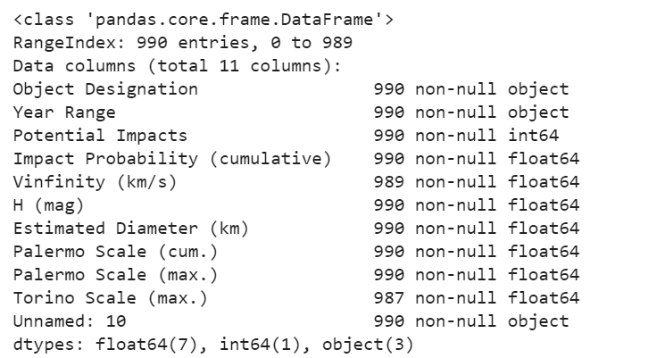 Fig 3 — Data types summary
Apart from that, there doesn’t seem to be any surprises. The Year Range column could do with some cleaning up, it would have been more useful if this range was broken into two columns as “Year From” and “Year To” as opposed to using a single string object to denote a range.
The numerical values are of a float data type with integers being used for the number of potential impacts. Looking more closely at the descriptive statistics,
sentry_data.describe()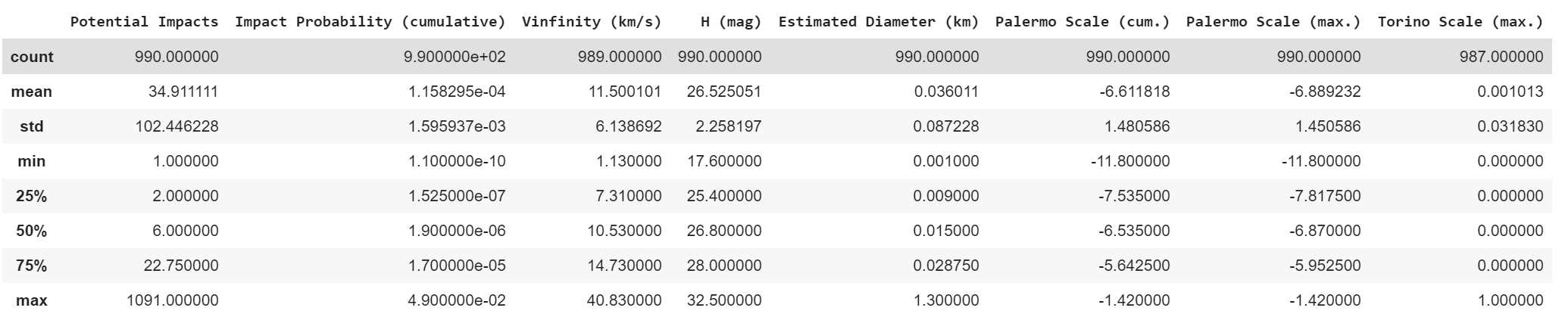 Fig 4 — Descriptive stats
There’s a lot to take in here. It’s worth noting that the maximum cumulative impact probability seems to be 0.049 or 4.9%. There also seems to be an object that may potentially impact Earth 1091 times. The Year Range and other non-numerical data are not included in this table as they are string objects.
Let’s plot some histograms. I’m setting the fig size to be fairly reasonable as I suspect that we may miss seeing some data on a smaller plot.
sentry_data.hist(figsize=(25,25))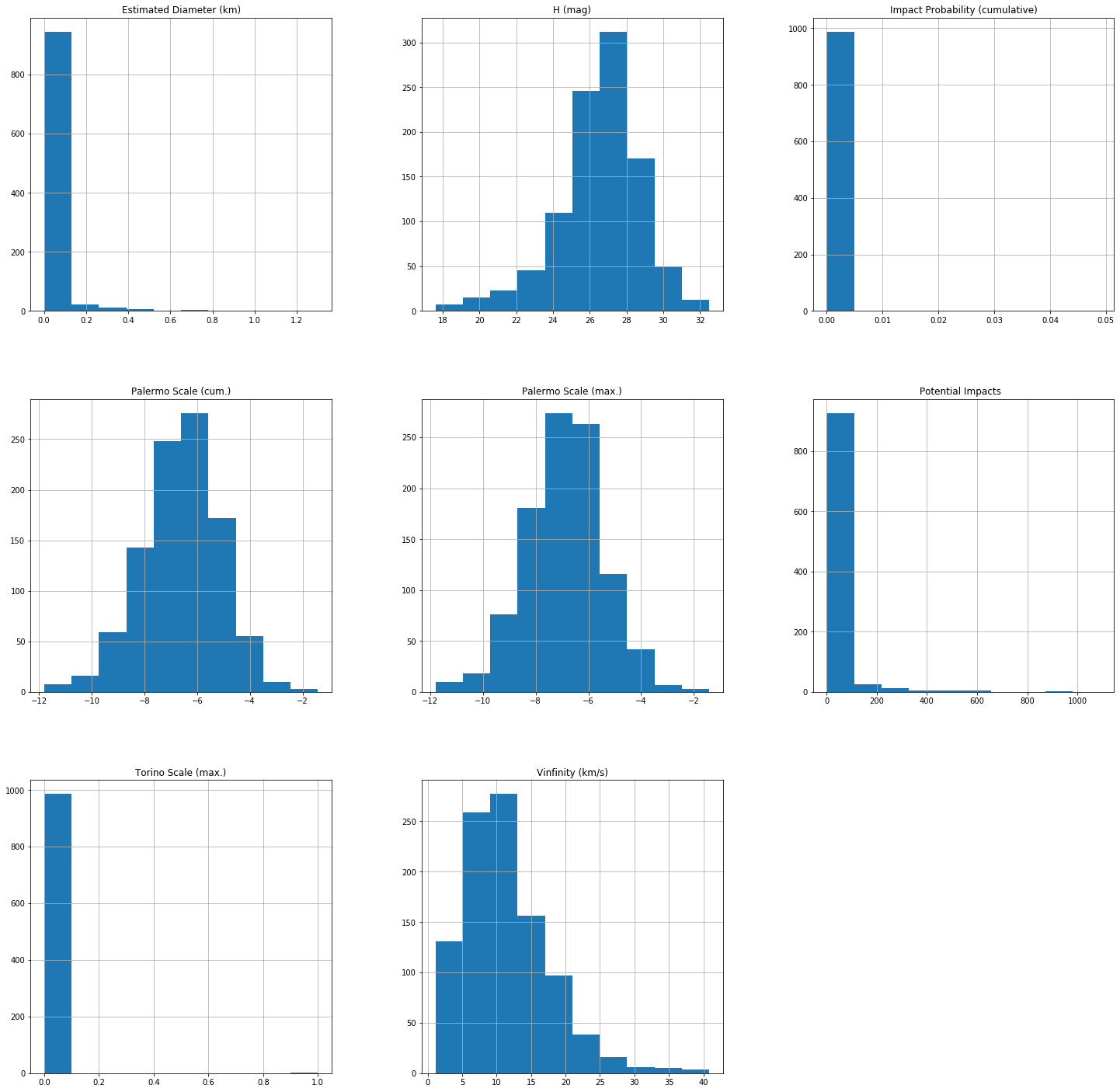 Fig 5 — Histograms
The plots provide a richer view of the data than just descriptive statistics. A really cool point to note is that we can barely see the Maximum Cumulative Impact Probability (4.9%) on the histogram in this plot as the count may be too small (a few events).
Okay so we did some basic descriptive stats and got to know the data types and the context a little bit using the CNEOS legend and some basic Python functions.
In my next post, we will be exploring the dataset further and will gain a deeper understanding of measuring the materiality of potential impacts and other interesting concepts that come up in this type of astronomical work.
The notebook for this post can be found here.