 |||
|||

I’ve been pretty busy working with some data from an experiment. I’m trying to fit a subset of the data to a model distribution/distributions where one of the functions follows a normal distribution (in linear space). Sounds pretty simple right? Based on the domain knowledge of this problem, I also know that the data can probably be fitted by a mixture model and more specifically a Gaussian mixture model. Brilliant you say! Why not try something like,
from sklearn.mixture import GaussianMixture
model = GaussianMixture(*my arguments/params*)
model.fit(*my arguments/params*))
But try as I might I couldn’t find parameters that should model the underlying processes that generated the data. I had all sorts of issues from overfitting the data to nonsensical standard deviation values. Finally, after a lot of munging, reading and advice from my supervisor I figured out how to make this problem work for me and move onto the next step. In this post I want to focus on why the log domain can be useful in understanding the underlying structure of the data and can aid in data exploration when used in conjunction with kernel density estimation (KDE) and KDE plots. Let’s look at this dataset in a bit more detail. Importing some useful libraries for later,
import numpy as np
import pandas as pd
import matplotlib.pyplot as plt
import seaborn as sns
#plot settings
plt.rcParams["figure.figsize"] = [16,9]
sns.set_style('darkgrid')
I’ve made the plots a little bigger and I’m using seaborn which enables me to manage the plots a little better and simultaneously make them look good! Reading the CSV with the data and getting to the subset that’s relevant to this project,
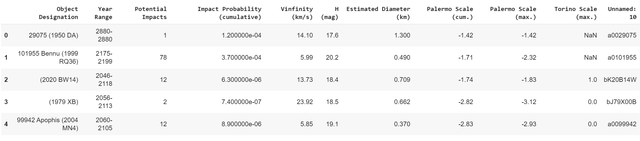
df = pd.read_csv("my_path/my_csv.csv")
df_sig = df[df['astrometric_excess_noise_sig']>1e-4]
df_sig = df_sig['astrometric_excess_noise_sig']
#describing the data
df_sig.describe()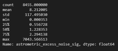
As you can see, the maximum is close to 7000 while the minimum is of the order 1e-4. This is a fairly large range as the difference between the smallest and the largest value in this data frame is of the order 1e+7. This is where I had a bit of a moment/brain fart. Let’s walk through my moment!
I tried a fairly naive plot of this data and realised that it looks like this,
plt.hist(df_sig, bins=150)
plt.xlabel('Astrometric Excess Noise Sigma', fontsize=12)
plt.ylabel('Frequency',fontsize=12)
plt.legend()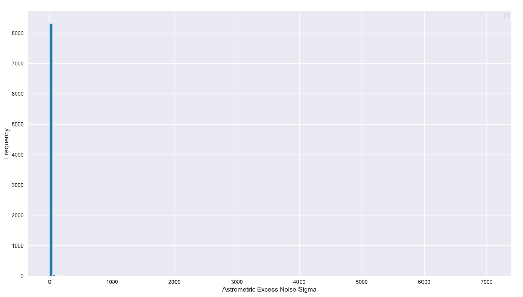
So this is with something like 150 bins. This should have been my first clue! The maximum value and values that extend beyond a few hundred have relatively fewer number of samples compared to the values that are a lot closer to zero or even in the tens.
After a LOT of blind alleys, I switched to the log domain.
Yes everyone, the log domain!
(If you want to know all the blind alleys I went down drop me a DM on Twitter and I’ll explain. I’m going to focus on the solution here instead!)
Why the log domain? (specifically log of base e or the natural logarithm). If you look at the (hideous) histogram above you’ll notice that the count is not “sensitive” enough to pick up the low frequency and high-value samples that extend beyond a few tens on the x-axis. Furthermore, the domain knowledge indicated that this data might be due to three underlying processes and potentially can be explained by a mixture model of three components that map onto these processes. Sadly, this structure is not visible in the linear domain due to the massive spread in the data and the low frequency of some of the samples (which is to be expected in this kind of experiment).
Switching to the log domain (or log10 if you like!) can address this problem.
df_sig_log = np.log(df_sig)
#converting to a numpy ndarray here because I'll need it later
df_sig_log_np = df_sig_log.to_numpy()
plt.hist(df_sig_log_np, bins=150)
plt.xlabel('Astrometric Excess Noise Sigma', fontsize=12)
plt.ylabel('Frequency',fontsize=12)
plt.legend()
plt.grid(True)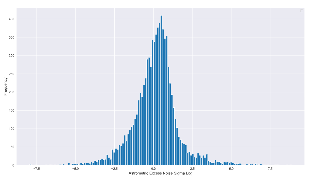
Ah structure! I see you now. It looks like the data has a lot more structure than the linear pot was able to reveal. The domain knowledge indicates that one of the components of the Gaussian mixture model is a mean zero Gaussian with a standard deviation of 1. This means that by about x = 3 on the linear scale the Gaussian should significantly taper down and approach zero (99% of the samples within this linear Gaussian). Converting to the log domain, log(3) is approximately 1.09… which means the samples contributing to this Gaussian should end somewhere between 0.0 and 2.5 on the log domain plot.
So what’s all this other stuff beyond 1.09…?
Well, some of it is the tail of the N(0,1) Gaussian but it looks like there’s a whole bunch of other data points with reasonably high frequencies.
Drumroll
These are the other components of the Gaussian mixture model as noted by the domain knowledge! Voila!
Now we’re ready to start exploring the data and understand the behaviour of each component and how they may fit this experimental dataset.
When fitting a mixture model, a kernel density estimation is a great way to start. Jake Vanderplas probably has one of the best writeups on how to perform a KDE on Python. The code may be a little dated as we have moved onto newer versions of numpy, scipy etc. since his post was published but it’s still an amazing resource as long as you tweak the code a little bit. His book is also highly recommended!
So what is a KDE? there are a whole bunch of resources that you can use to understand what a KDE is and how it functions, Jake Vanderplas for example states,
Kernel density estimation (KDE) is in some senses an algorithm which takes the mixture-of-Gaussians idea to its logical extreme: it uses a mixture consisting of one Gaussian component per point, resulting in an essentially non-parametric estimator of density.
This video is also pretty neat and gets to the point pretty quickly.
This method is great at illustrating how a KDE works. I’ve also added a rug plot to indicate the locations of the samples/experimental data. This is helpful when comparing a KDE, a histogram and the spread of the samples across the domain.
from scipy.stats import norm
data = df_sig_log_np
#I'm keeping the domain restricted to the domain of the data
x_d = np.linspace(df_sig_log.min(), df_sig_log.max(), 1000)
density = sum(norm(xi).pdf(x_d) for xi in data)
plt.fill_between(x_d, density, alpha=0.5)
#this is called a rug plot and indicates the location of the data on the x axis
plt.plot(data, np.full_like(df_sig_log_np, -0.1), '|k', markeredgewidth=1)
plt.xlabel('Astrometric Excess Noise Sigma Log - KDE', fontsize=12)
plt.ylabel('Frequency',fontsize=12)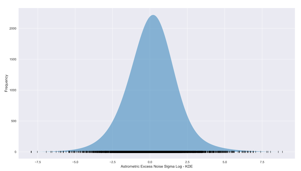 KDE using scipy.stats norm
The KDE looks a lot like our original log domain histogram! You’ll notice that the peak values of the plots don’t agree with each other. This is a result of the bandwidth of the KDE and/or the bin size of the histogram and is definitely not a deal-breaker!
Let’s superimpose both plots,
from scipy.stats import norm

data = df_sig_log_np
x_d = np.linspace(df_sig_log.min(), df_sig_log.max(), 1000)
density = sum(norm(xi).pdf(x_d) for xi in data)

plt.fill_between(x_d, density, alpha=0.5, label='KDE')
plt.plot(data, np.full_like(df_sig_log_np, -0.1), '|k', markeredgewidth=1,label='Observational Samples')
plt.hist(df_sig_log_np, bins=25, color='coral', alpha=0.5, label='Observational Hist')
plt.xlabel('Astrometric Excess Noise Sigma Log', fontsize=12)
plt.ylabel('Frequency',fontsize=12)
plt.legend() 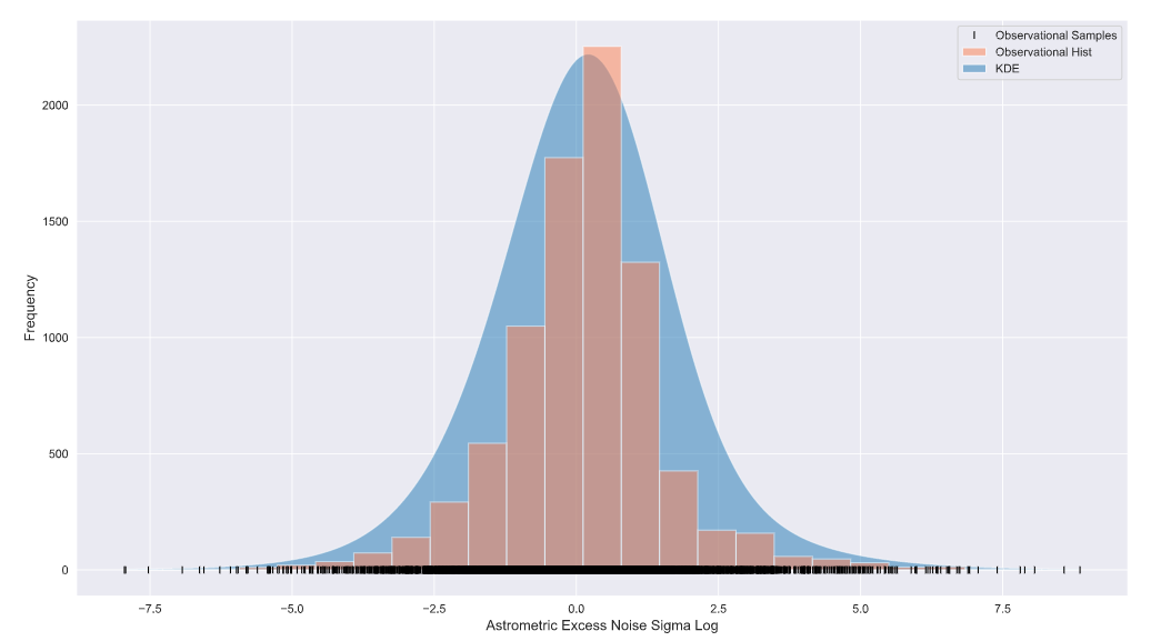
There you have it folks, if you have a data set (often from an experiment) with samples across a large domain AND low-frequency values at higher (or lower) end of the domain, converting to the log domain may be for you!
Tune in for my next post as I explore KDE methods in detail and look at a few other popular approaches to visualise the KDE, all in the log domain of course!
See you on the next one!